How to Turn Website Visitors Into Customers
Getting traffic is only half the battle. I share the conversion strategies I use to help Denver businesses turn website visitors into actual paying.
Key Takeaways
- •The average business website converts less than 3 percent of visitors into leads
- •Clear calls to action on every page are the single biggest conversion lever
- •Reducing friction in forms and contact methods dramatically increases conversion rates
- •Trust signals like reviews, testimonials, and real photos move visitors from browsing to buying
- •Conversion optimization compounds, and small improvements add up to major revenue gains over time
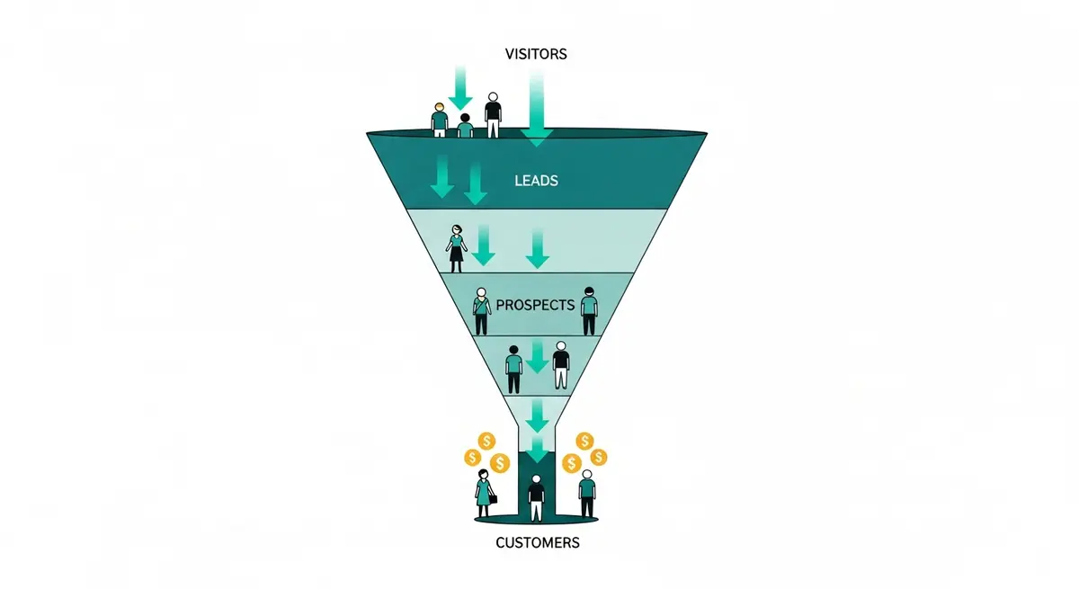
For every 100 people who visit a typical business website, somewhere between 97 and 99 leave without doing a single thing. No phone call. No form submission. No purchase. They found the site, looked around for a few seconds, and vanished.
This number matters because it represents the gap between traffic and revenue. Getting a website to the top of Google is only half the equation. If visitors arrive and leave without reaching out, the rankings are just a vanity metric.
It's a common scenario: a business sees organic traffic double, but the phone doesn't ring any more than before. The SEO is working. The website is failing.
What's going wrong
The site doesn't ask for anything
You're on a website. You're interested. What do you do now? There's no phone number in the header. No "Get a Free Estimate" button. The contact form is buried on a separate page behind two clicks. The site just presents information and then... nothing.
Every page needs a next step. Visible. Above the fold. Worded clearly. Not tucked into the footer in 10-point font.
There's too much friction
A contact form with 12 fields asking for company size, annual revenue, preferred time to call, and how the visitor discovered the business? Most people close the tab before finishing reading the labels. Each additional field reduces completions.
The best approach is keeping forms to three or four fields: name, email or phone, and a brief message. You can learn everything else during the actual conversation.
Nobody trusts you yet
This is the part most business owners overlook. A person who just found your website through Google has zero relationship with you. They don't know your name, your reputation, or whether you'll actually show up. Without real testimonials, authentic photos, and a genuine About page, there's no reason for a stranger to hand over their contact information.
The mobile experience is painful
If someone can't tap your phone number, can't read your text without zooming, and can't complete your form without switching to landscape mode, they're leaving. Mobile optimization directly impacts whether visitors convert.
What actually increases conversions
Clarity first, always
A visitor should understand three things within five seconds of hitting your homepage:
- What you do
- Who you do it for
- What they should do next
The StoryBrand framework works well for structuring this. The headline addresses the customer's problem. The subheadline positions you as the solution. The button tells them exactly what happens next.
Consider the difference between "Welcome to Our Website" as a headline versus "Get a Fence That Actually Lasts" with a "Get Your Free Estimate" button. The second version tells visitors exactly what the business does and what to do next. Same traffic, different words, dramatically different results.
Remove every possible obstacle
Forms. Three to four fields. Name, phone, email, message. Done.
Phone. Clickable number in the header. Visible on every page. One tap to call on mobile.
Messaging. If your business can handle text or chat inquiries, add a lightweight contact widget. Some people prefer typing over talking.
Scheduling. Embed a booking tool like Calendly directly on the page. Eliminates the back-and-forth of finding a time that works.
Layer trust signals throughout the page
Trust builds progressively as someone scrolls:
Top of the page. Clean design, clear headline, any recognizable certifications or association logos.
Middle of the page. Specific testimonials with full names and results. Real project photos, not stock images.
Service details. Transparent descriptions of what you do and how the process works. Pricing context if possible.
About page. Your actual story. Your credentials. Why you care about this work.
Contact section. A low-commitment offer like a free consultation or audit. Makes the first step feel easy, not risky.
Put conversion points on every page
Don't funnel all your conversion weight through a single contact page. Every page should offer at least one way to take action:
- Service pages: "Request a Quote" form
- Blog posts: "Want help with this? Let's talk" or an email signup
- About page: "Ready to work together? Here's how to start"
- Homepage: CTAs at the top, middle, and bottom of the scroll
Speed kills hesitation
A slow website destroys conversions before any design or copy can help. Research suggests every additional second of load time reduces conversions by roughly seven percent. If your site takes five seconds to load, you've already lost a significant chunk of potential leads before they see a single word.
Tracking what's working
Set up real measurement
At minimum, you should be tracking:
- Form submissions
- Phone calls (use a tracking number)
- Email link clicks
- Chat or messaging conversations
Without data, you're guessing. I go deeper into measurement in my guide on tracking SEO ROI.
Test, learn, adjust
Conversion optimization isn't a one-time project. The most effective approach involves testing variations of:
- Headlines and value propositions
- Button text and placement
- Form length and field labels
- Where testimonials appear
- Page layouts and section order
Small changes produce real results. Industry data consistently shows that changing button text from "Submit" to "Get My Free Quote" can increase form completions significantly. The word "submit" sounds like paperwork. "Get My Free Quote" sounds like value.
Prioritize your highest-traffic pages
Start optimizing the pages that get the most visits:
- Homepage
- Top service page
- About page
- Contact page
- Most popular blog posts
Improving conversion rates on these five pages has more impact than tweaking 50 pages that barely get traffic.
SEO and conversions aren't separate things
Good content brings visitors. A well-built website converts them. On-page SEO and conversion optimization share most of the same principles: clear headlines, organized content, fast load times, mobile-friendly design.
I don't treat these as separate projects. Every recommendation I make considers both visibility and conversions. There's no point ranking well for a keyword if the page people land on doesn't do anything useful.
What to check first during a conversion audit
When a business gets traffic but no leads, the diagnosis usually follows a specific process.
Homepage
The homepage is where most visitors land and where most businesses lose them. Three immediate checks: Is the headline about the visitor's problem or about the business patting itself on the back? Is there a visible CTA above the fold? Does the page load in under three seconds?
A headline like "Serving the Front Range Since 1998" says nothing about the visitor. Something like "Your Move, Without the Stress" with a "Get a Free Moving Estimate" button front and center speaks directly to what the customer needs. That kind of shift can dramatically increase inquiries.
Service pages
Most service pages read like feature lists. "We offer residential and commercial painting services." That tells a visitor nothing useful. A service page should answer: What problem does this solve? What does the process look like? What should I expect to pay? What do I do next?
Each service deserves its own page with a natural flow: problem, solution, process, proof, call to action.
Contact page
The contact page should be the simplest page on the entire site. Look for unnecessary fields, broken forms, missing phone numbers, and anything that creates hesitation. Even an overly aggressive CAPTCHA can block real people from submitting inquiries without anyone realizing it.
Why visitors hesitate
Understanding the psychology helps you fix the right things.
Uncertainty
They aren't sure you can solve their specific problem. The site uses general language that could apply to any business. Fix this with specificity. "I help Denver restaurants fill empty tables on slow nights" connects. "We help businesses grow" doesn't.
Perceived risk
Taking action feels risky. What if I get a hard sell? What if it costs way more than I expect? Reduce this by offering something low-commitment. "Free 15-minute phone consultation" is far less intimidating than "Request a Quote." Real testimonials from real people reduce perceived risk by showing others had positive experiences.
Effort
Every extra click, every extra form field, every confusing menu adds effort. People follow the path of least resistance. If your competitor's site makes it easier to get in touch, the lead goes there.
A common mistake is embedding a phone number in an image. On mobile, that means memorizing the number, opening the dialer, and typing it in manually. Nobody does that.
High-impact changes and why they work
These are the types of improvements that consistently move the needle for business websites.
Shortening a contact form from nine or more fields to four. Removing unnecessary questions like "preferred appointment time" and "type of system" eliminates friction. Fewer fields means more completions.
Adding a phone number to a sticky header. When the phone number is only in the footer, mobile users have to scroll all the way down to find it. A sticky header makes it visible and tappable on every page.
Placing testimonials on the homepage. Many sites save testimonials for a separate page nobody visits. Adding three or four short quotes directly beneath key content on the homepage reduces bounce rates by building trust immediately.
No redesigns needed. Just removing friction and adding trust.
Patterns worth watching for
Stock photos everywhere. Visitors can tell. Real photos of your team, your workspace, and your actual work build credibility that stock images destroy.
Zero pricing context. You don't need to list exact prices, but giving visitors nothing makes them leave for the competitor who at least says "projects starting at $X." A range or "request a custom quote" approach beats total silence.
Stale content. A blog post from 2020, a copyright footer from 2022, a team page showing people who left the company. All of these signal neglect.
Autoplay video. It still happens. It always hurts conversions. Just don't.
Frequently asked questions
What is a good conversion rate for a business website?
Most healthy business sites convert between two and five percent of visitors into leads. That means for every 100 visitors, two to five take meaningful action: filling out a form, calling, or booking an appointment.
If you're below one percent, something fundamental is broken, whether it's your calls to action, page speed, or trust signals. The specific bottleneck is usually identifiable quickly with a focused audit.
How fast does conversion rate optimization show results?
Most changes show measurable impact within two to four weeks, and some produce results within days. Unlike SEO which can take months, conversion optimization works on the traffic you already have. Moving a phone number to the header or shortening a form can produce results almost immediately.
Should I use pop-ups to capture leads?
I generally advise against aggressive pop-ups, especially on phones, because Google penalizes intrusive interstitials and most visitors find them annoying. A better approach is an embedded form or a subtle banner that doesn't block the content.
Exit-intent pop-ups on desktop can work if the offer has genuine value (a free checklist or audit, for example), but they should never feel desperate.
Do I need a professional to optimize conversions?
You can make significant improvements on your own by adding clear CTAs, shortening forms, making your phone number visible, and displaying real testimonials. Start there.
If you've addressed all of those and conversions are still flat, a professional audit uncovers deeper issues with site architecture, messaging, or user flow that are harder to spot from the inside.
Wrapping up
Traffic without conversions is a vanity metric. Your website exists to generate business, and every element on every page should serve that purpose.
Without conversion optimization, you're paying for traffic that walks through the front door and leaves without saying a word. That wasted traffic is wasted money.
Picture every page on your site pulling its weight: clear calls to action, trust signals in the right places, and a frictionless path from "interested" to "let's go." That's where real revenue growth starts.
If your site gets visitors but doesn't produce leads, the fix is usually more straightforward than you'd expect. Let's talk about where people are dropping off and what to do about it.
Want me to help with your SEO?
I help small businesses get found on Google. Let me show you what I can do for yours.
Let's talk