How Heatmaps Show What Visitors Really Do
Heatmaps show you exactly where visitors click, scroll, and get stuck. I explain how I use them to find conversion killers and fix them for Denver.
Key Takeaways
- •Heatmaps reveal user behavior that analytics numbers can't. You literally see where people click and scroll
- •Most visitors never scroll past 50 percent of your page, so critical content must be above the fold
- •Click heatmaps often reveal that visitors click on elements that aren't actually links
- •Scroll heatmaps show exactly where you're losing attention, so you can restructure content
- •Even a simple heatmap test on your homepage can reveal conversion-killing design issues
What if you could stand behind every person who visits your website and watch exactly what they do? Where they click. How far they scroll. Which sections grab their attention and which ones they blow right past.
That is basically what a heatmap gives you.
Google Analytics tells you the numbers: how many people visited, how long they stayed, which pages they viewed. Heatmaps tell you the story behind those numbers. They are the single most underrated tool I use when diagnosing why a website is not converting.
This post is part of my Analytics series.
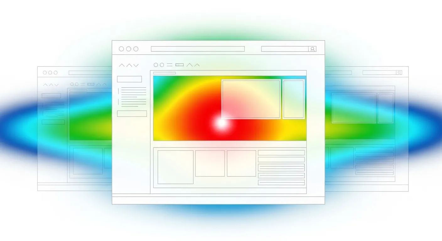
Three types of heatmaps and what each reveals
Click heatmaps
A click heatmap paints your page in warm and cool colors based on where visitors tap or click. Red and orange spots indicate heavy click activity. Blue and green areas show little to no interaction.
What click heatmaps expose:
- Whether visitors are actually clicking your calls to action
- Whether people click on images or text that look interactive but are not actually links
- Which navigation items attract attention and which go ignored
- Whether important buttons are positioned where eyeballs naturally land
Scroll heatmaps
A scroll heatmap shows how far down visitors get before they leave. The top of your page is always hot because 100 percent of visitors see it. The color gradient shifts cooler as you move down, marking exactly where people stop reading.
Scroll maps answer critical questions:
- How much of your page do people actually see?
- Is your most important content above or below the attention drop-off point?
- Are visitors reaching your contact form or CTA at the bottom?
One of the most common problems I find: a business owner's primary call to action sits below the point where 70 percent of visitors have already left.
Move heatmaps
These track mouse cursor movement on desktop. Cursor position roughly correlates with where a person is looking. Move heatmaps are less useful for mobile visitors since there is no cursor, but on desktop they add another layer of insight into attention patterns.
Patterns I see over and over
Across heatmap tests on service business websites, certain findings repeat constantly.
The buried CTA problem
The main conversion element sits at the bottom of a long page. The heatmap shows a sharp attention cliff about 50 to 60 percent of the way down. Most visitors never reach the form. The fix is simple: add a CTA higher on the page, or repeat it at multiple scroll depths.
Ghost clicks on non-interactive elements
Visitors click on images, bold text, or styled headings that look like they should be interactive. These dead clicks signal confusion. If people think something is a link, make it one. Or redesign it so it does not look clickable.
Ignored navigation items
Some nav links get constant clicks. Others sit untouched for weeks. Heatmap data lets me simplify navigation by removing what nobody uses and making popular items more prominent.
Skipped content blocks
Large paragraphs of text, certain section styles, or specific page elements sometimes show zero engagement. Visitors scroll past them without a pause. This tells me the content is either irrelevant to visitors or formatted in a way that discourages reading.
Different behavior on mobile versus desktop
Visitors on phones interact with pages differently than desktop users. I always run separate heatmap tests for both device types. A layout that works beautifully on a wide screen can completely fail on a narrow phone display.
A practical process for using heatmaps
Identify target pages
Start with pages that carry the most weight: homepage, primary service page, about page, contact page, and top-performing blog posts. These are the pages where visitor behavior directly affects revenue.
Install lightweight tracking
Use heatmap tools that load asynchronously so they do not slow down the site. Tracking should run for two to four weeks depending on traffic volume to collect enough data for reliable patterns.
Read the results
Look at each heatmap asking specific questions: Where are the heaviest click clusters? Where does scrolling stop? Are CTAs getting attention? Are there dead clicks on non-interactive elements? What does mobile behavior look like compared to desktop?
Make targeted changes
Based on what the data shows, make specific, measurable adjustments:
- Reposition CTAs to areas where attention is highest
- Add visual cues like arrows or contrasting colors to guide scrolling
- Remove or redesign confusing elements that generate dead clicks
- Restructure or shorten content that visitors skip entirely
Retest to confirm
After changes go live, run a fresh heatmap test to verify that the adjustments actually improved behavior. This creates a cycle of continuous improvement grounded in real data rather than assumptions.
Surprising findings from heatmap testing
Some of what heatmaps reveal is counterintuitive:
- Image carousels and sliders get almost no engagement past the first slide. Visitors rarely click the arrows or swipe.
- Phone numbers on a page that are not clickable still get tapped constantly on mobile. Always make phone numbers tap-to-call links.
- CTAs placed above the fold outperform bottom-of-page CTAs by five to ten times in click volume.
- Larger, simpler contact forms get more submissions than small, tucked-away forms.
- Mobile users actually scroll further than desktop users on engaging content, but they bail faster on dense text walls.
Choosing a heatmap tool
You do not need a big budget to start using heatmaps.
Microsoft Clarity
Completely free with no traffic limits. Provides heatmaps and session recordings through a clean interface. For businesses watching their budget, Clarity is remarkably capable. It lacks some advanced segmentation features of paid tools, but for straightforward heatmap analysis it handles the job well.
Hotjar
My go-to recommendation for most businesses. The free plan provides enough data to analyze your key pages, and setup involves adding a single tracking script to your site. Hotjar bundles click heatmaps, scroll heatmaps, and session recordings into one tool, which gives a complete behavioral picture.
Crazy Egg
Offers more granular segmentation than the other two. You can filter heatmaps by traffic source, device type, or referring site. This matters when you want to see whether visitors from Google search behave differently from visitors arriving through social media or email campaigns.
What I prioritize in a tool
Regardless of which tool you pick, I focus on these features: a lightweight tracking snippet that does not hurt website speed, separate mobile and desktop heatmaps, scroll depth tracking, and the ability to run heatmaps on selected pages rather than the entire site.
Combining heatmaps with other data sources
Heatmaps show what is happening. Pairing them with other tools helps explain why.
Heatmaps plus analytics
When Google Analytics shows a high bounce rate on a page, the heatmap explains the cause. Maybe visitors scroll halfway, hit a wall of text, and leave. Maybe they click an image expecting it to enlarge and nothing happens. The bounce rate flags the problem. The heatmap pinpoints it.
Heatmaps plus A/B testing
Once a heatmap identifies an issue, A/B testing validates the fix. If the heatmap reveals visitors are not scrolling to your CTA, you can test moving the CTA higher. The A/B test measures whether that change actually improves conversions, not just engagement patterns.
Heatmaps plus session recordings
Most heatmap tools include session recordings that replay individual visitor sessions. Heatmaps show aggregate behavior. Recordings show individual journeys. When a heatmap reveals unexpected clicking on a section, I watch 10 to 15 session recordings to understand exactly what visitors are trying to do.
Heatmaps plus on-page surveys
Sometimes the data still leaves gaps. A simple survey prompt like "Did you find what you were looking for?" adds qualitative context. When a heatmap shows people abandoning a page without clicking the CTA, a survey might reveal that pricing info was missing or the form asked for too much personal information.
Turning heatmap data into measurable results
Collecting data is easy. Using it effectively separates businesses that improve from businesses that just stare at colorful screenshots.
Prioritize by business impact
Not every finding warrants action. I rank issues by two criteria: how many visitors are affected, and how closely the problem relates to revenue. A dead click on a decorative blog image is a minor curiosity. A dead click on what visitors perceive as a pricing link on your main service page is urgent.
Change one thing at a time
When a heatmap surfaces multiple issues, resist the urge to fix everything at once. Make one change, run a new test, and measure the impact. Changing three elements simultaneously makes it impossible to know which adjustment produced the result.
Run tests continuously
I recommend always-on heatmap tracking for your most important pages with a formal review each month. This catches emerging issues early rather than after they have cost months of lost conversions. It also reveals seasonal shifts in behavior.
Keep a change log
Document what you found, what you changed, and what happened afterward. Over time this record becomes invaluable because it reveals what works for your specific audience. What works for a dental practice may not work for a law firm. Your heatmap data tells you what works for you.
Frequently Asked Questions
Will heatmap tracking slow down my website?
Modern heatmap tools like Hotjar and Microsoft Clarity load asynchronously and typically add only 50 to 100 milliseconds to load time. They do not block your page from rendering, so the speed impact is well within acceptable limits. I still recommend checking your Core Web Vitals before and after installing tracking to confirm there is no meaningful change on your specific site.
How many visitors do I need for heatmap data to be useful?
Aim for at least 500 to 1,000 pageviews on a specific page before drawing conclusions. With fewer visits, the data is too sparse for reliable patterns. For lower-traffic pages, let the test run longer, two to four weeks instead of one, to accumulate sufficient data.
If your site has very low overall traffic, focus heatmap analysis on your homepage and top landing pages, which naturally have the highest visit volume.
Which pages should I run heatmaps on first?
Focus on pages that directly impact revenue: homepage, main service pages, contact page, and your highest-traffic blog posts. Also include your About page. Tracking every page creates a mountain of data without proportional insight.
Starting with three to five key pages, analyzing results, making improvements, and expanding to more pages as needed is the most efficient approach.
How often should I check my website heatmaps?
Running heatmaps continuously on critical pages and reviewing data monthly is the best practice. After significant page changes like a layout redesign, copy rewrite, or CTA repositioning, run a focused test for two to four weeks to measure impact. Seasonal traffic shifts and audience changes also warrant fresh testing because different visitors behave differently on the same page.
Heatmaps close the gap between what your analytics dashboard says and what visitors actually experience. Even one test on your homepage can uncover conversion problems that numbers alone would never reveal.
Without heatmap data, you are guessing why visitors leave without contacting you. Every day those hidden friction points stay unfixed, you lose leads to problems you cannot even see.
Now picture knowing exactly where every visitor clicks, scrolls, and gets stuck, then fixing those issues one by one and watching your conversion rate climb with each improvement. That clarity changes how you think about your website entirely.
Want to see what your visitors are really doing? Let's talk. I can set up tracking and show you exactly where people engage and where they drop off.
Want me to help with your SEO?
I help small businesses get found on Google. Let me show you what I can do for yours.
Let's talk